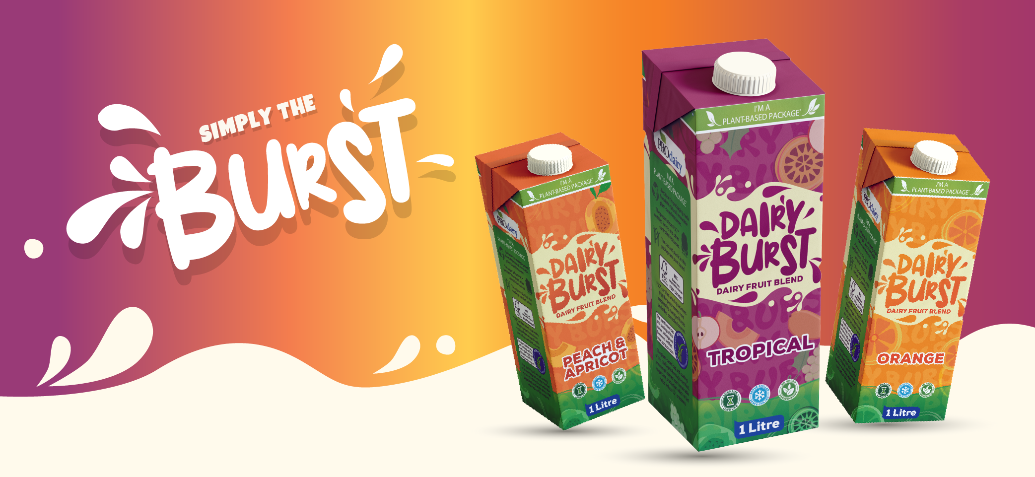
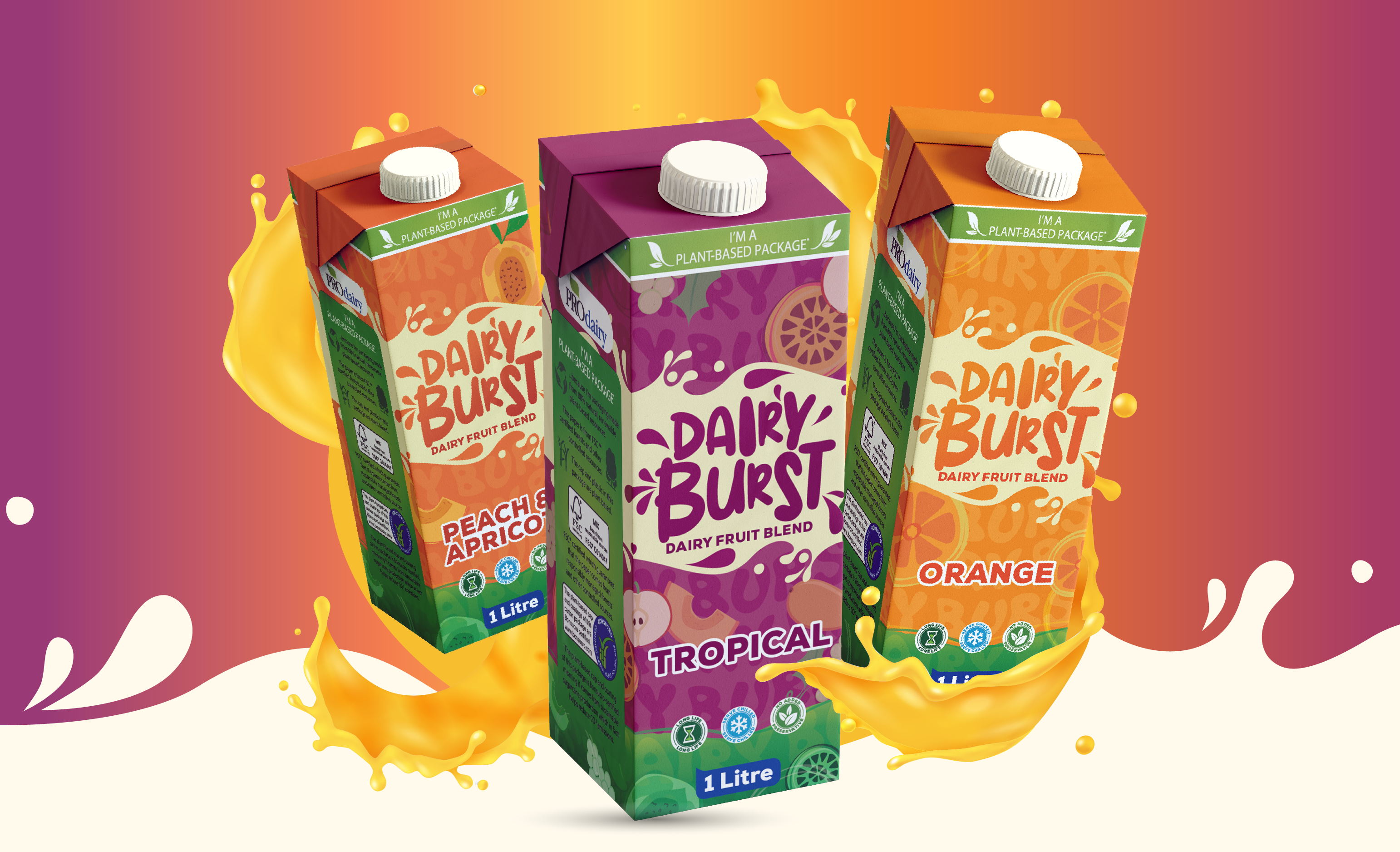
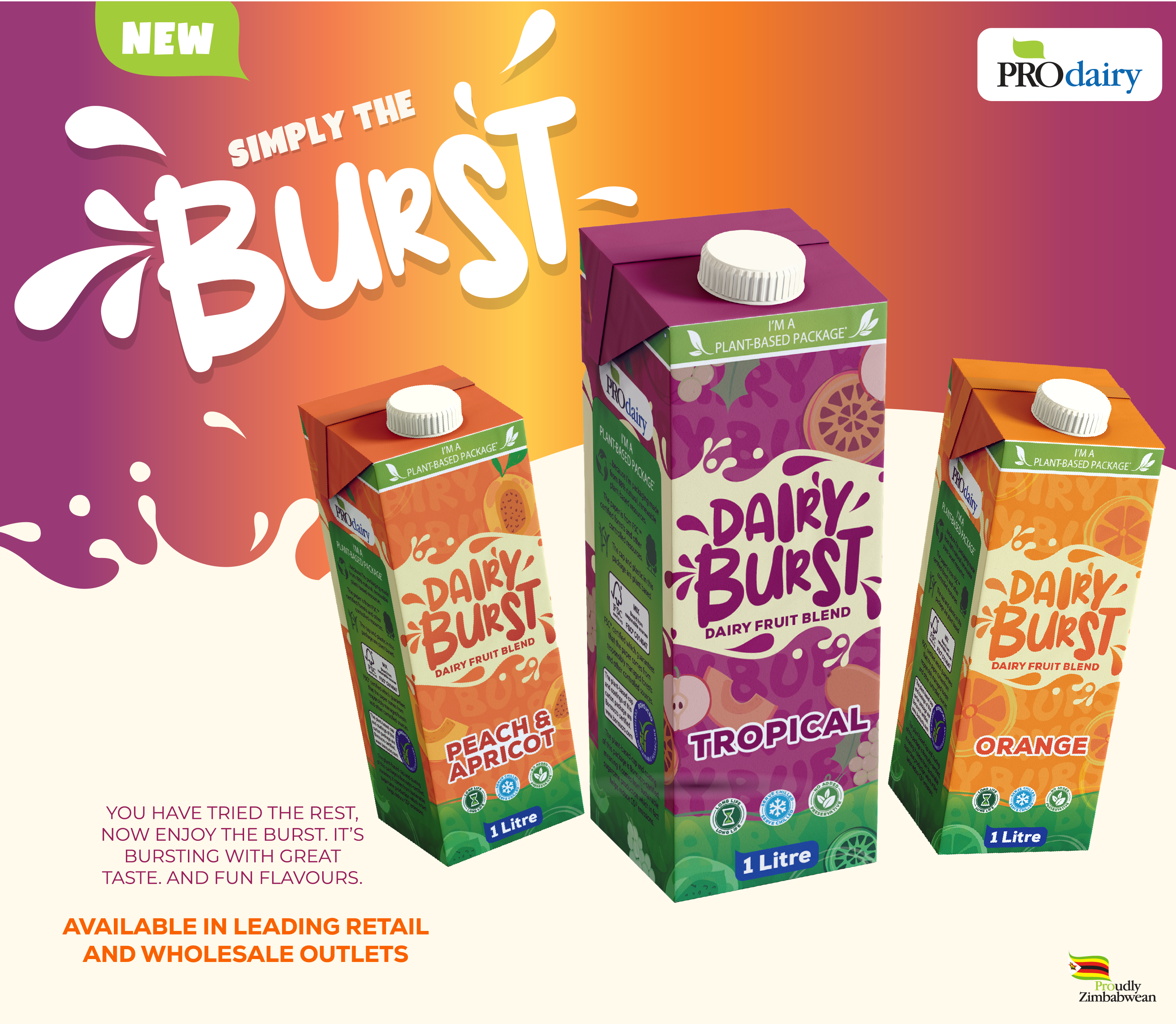
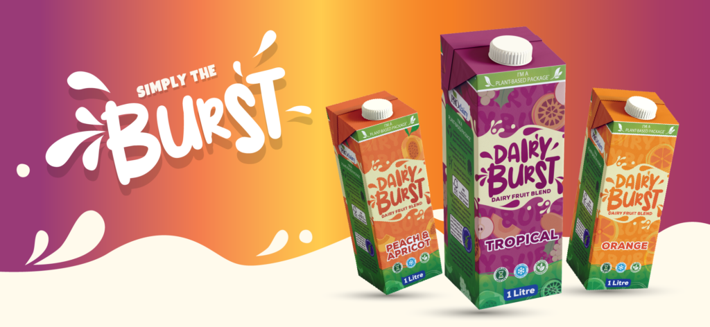
When Prodairy introduced Dairy Burst into its portfolio, the ambition was not incremental, it was expressive. This was more than a new dairy fruit blend; it was a new mood on shelf. We crafted the packaging as a celebration of flavour in motion: saturated tropical gradients that radiate warmth, a hand-drawn logotype that feels alive, and kinetic splash elements that translate creamy refreshment into visual energy.
Every design decision serves a commercial purpose ,bold enough to interrupt the aisle, structured enough to build trust, and scalable enough to extend across future variants. Sustainability cues and local provenance anchor the vibrancy in credibility, ensuring the pack feels both exciting and dependable. The result is a sub-brand that does not simply sit within the Prodairy stable, it pulses with its own rhythm, engineered for visibility, recall, and repeat purchase.